Cards
Card are used to show user related data collectively, like product details.
Example of Horizontal Card- Text+Image
Card's image may have a padding or it can be full-bleed. By default card's images are full-bleed. If you want image to have margin, you can use card class. Copy below code and put your desired text and image and you are good to go.
 New
New
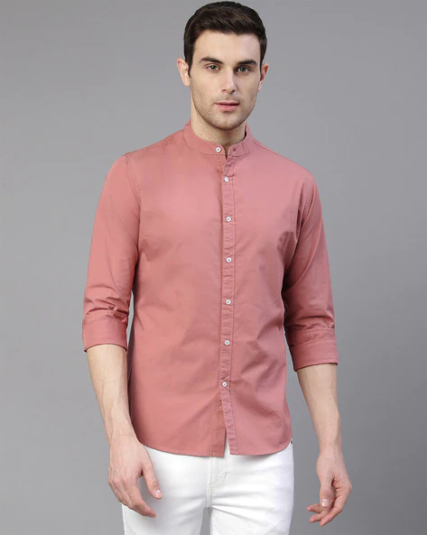
Light Pink Shirts
Men's casual shirts
Sold by: ZodiacPink shirts with full sleeves, has a shirt collar, perfect for office buddys
New
Light Pink Shirts
Men's casual shirts
Sold by: ZodiacPink shirts with full sleeves, has a shirt collar, perfect for office buddys
Example of Vertical Card- Text+Image
Below are 3 variations, card with badge, card with image default-container, card with close button. All the cards have like button.
New
Light Pink Shirts
Men's casual shirts
New
Light Pink Shirts
Men's casual shirts
New
Light Pink Shirts
Men's casual shirts
New
Light Pink Shirts
Men's casual shirts
Light Pink Shirts
Men's casual shirts
Pink shirts with full sleeves, has a shirt collar, perfect for office buddys